
Timeline
May 2022 - Aug 2022
Team
Core Business Team
My Role
Product Designer Intern
Design Lead
Responsibilities
UI Design, Graphic Design, Product Research, Prototyping
The Voyage Overview //
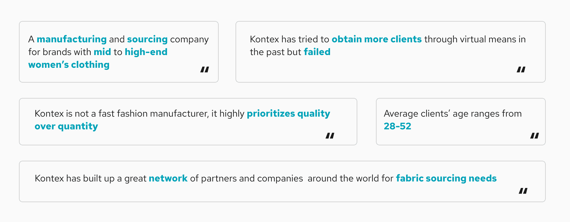
Kontex is an established player in the fashion manufacturing industry, with over 8 years of partnering with two prominent mid-luxury women’s fashion brands in the US.
I joined Kontex as a Product Designer to spearhead a rebranding initiative and represent the company at the MAGIC fashion event in Las Vegas. This rebrand aimed to align Kontex with its core business values, elevate its perceived value, and create a unified brand identity to attract potential clients. The effort paid off as we successfully onboarded two new clients at MAGIC.
More on design & display

Navigating the Challenge //
Kontex had a reputation for excellence, yet it struggled to convey its allure to potential clients.
Challenge
The mission was clear: we needed to revamp our brand identity, strike a chord with high-potential clients, and shine in a crowded fashion manufacturing landscape.
Setting the Coordinates //
Before starting the UX and product design process, I needed to first chart the territory. Interviews and Q&A sessions with Kontex's leadership and teams unveiled invaluable insights into the brand's strengths, weaknesses, and unique value propositions.
Unearthing User Insights //
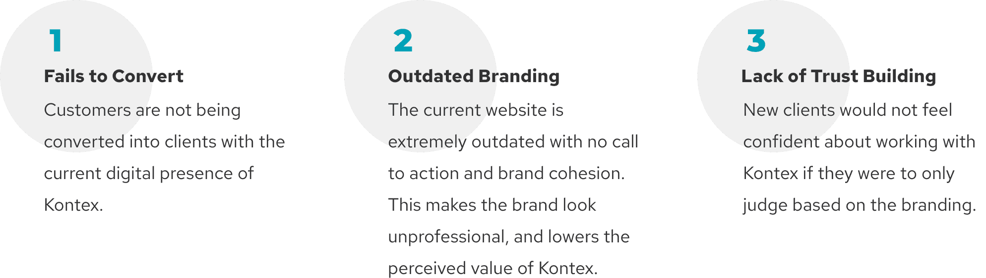
To gather unbiased perspectives, I reached out to past clients, including one who had chosen not to work with Kontex. This enlightening conversation revealed several key insights:
Key Findings
The website appeared outdated, casting doubt on its authenticity.
Despite positive word-of-mouth, trust issues persisted due to website discrepancies.
The website lacked compelling information, failing to convey high-end clothing production.
Prospective clients hesitated to contact Kontex due to misalignment in branding elements.
The Pre-Planning //
Kickstarting the project, I first explored competitors' websites for inspiration, though most were uninspiring. Nevertheless, I gleaned valuable insights that would inform our UX design strategy.
Key Findings
Over 90% of fashion manufacturing companies are based in Asia for cost-efficiency.
Over 80% of industry websites had outdated designs and unclear branding.
Target clients were primarily in North America and Europe.
Competitor Analysis //
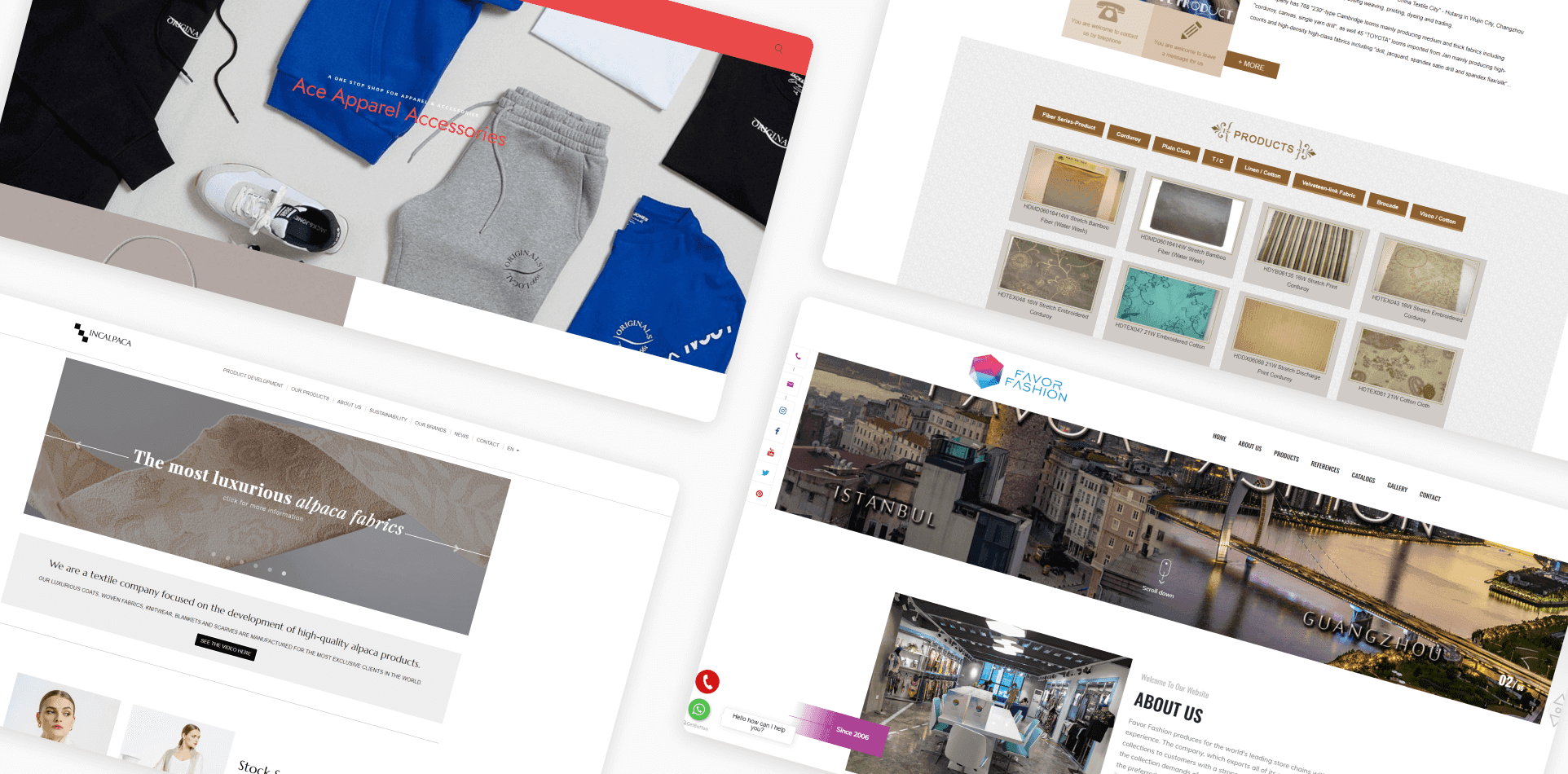
Most fashion manufacturing and sourcing companies don’t put effort into building their branding and digital presence because the thing about this industry is you only need a few reoccurring clients to survive.
Charting the Course //
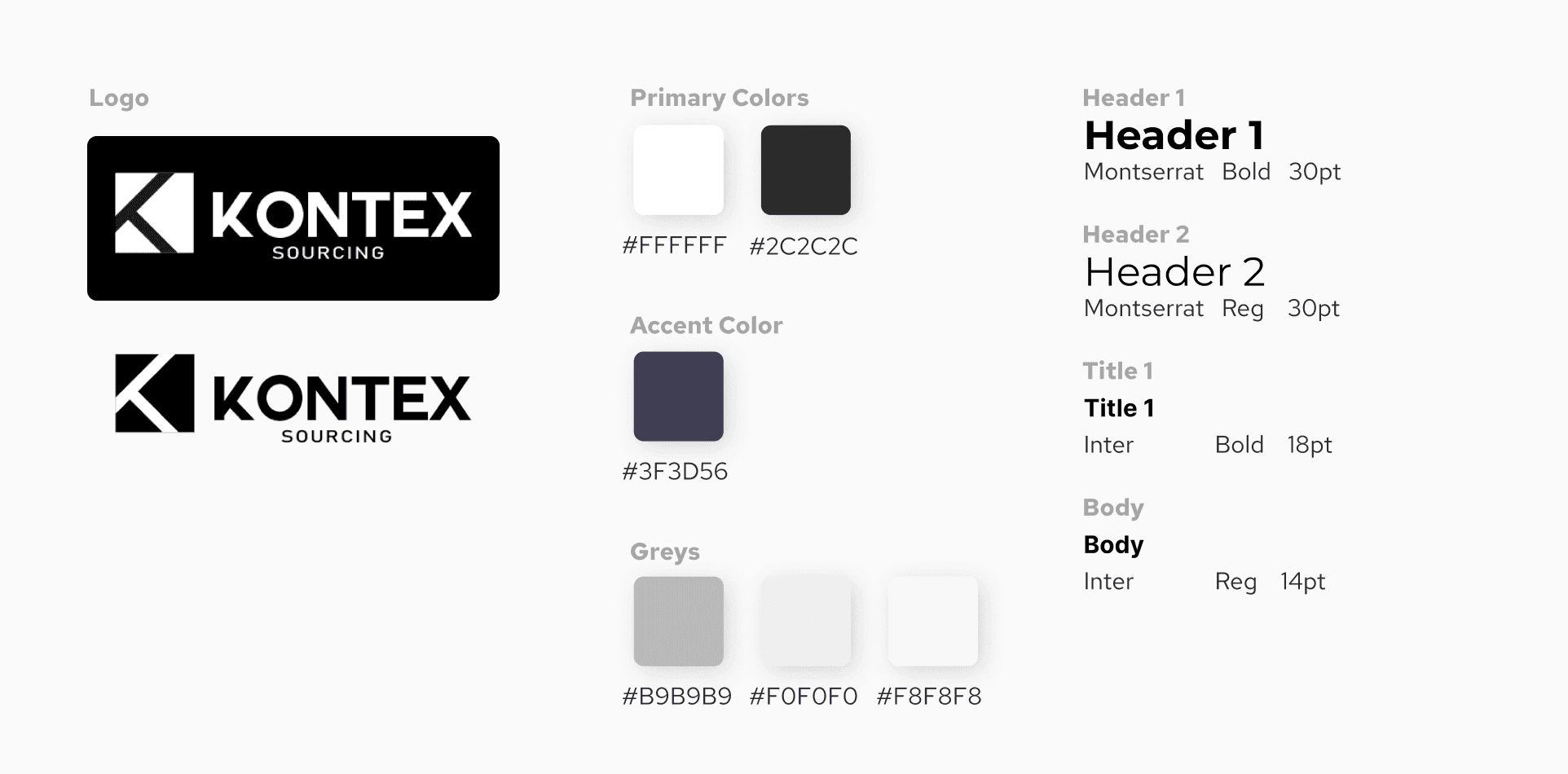
Armed with newfound knowledge, we set sail to create a UX that would differentiate Kontex, align with its core identity, and ensure seamless navigation. Black became our guiding star, symbolizing elegance and timelessness.
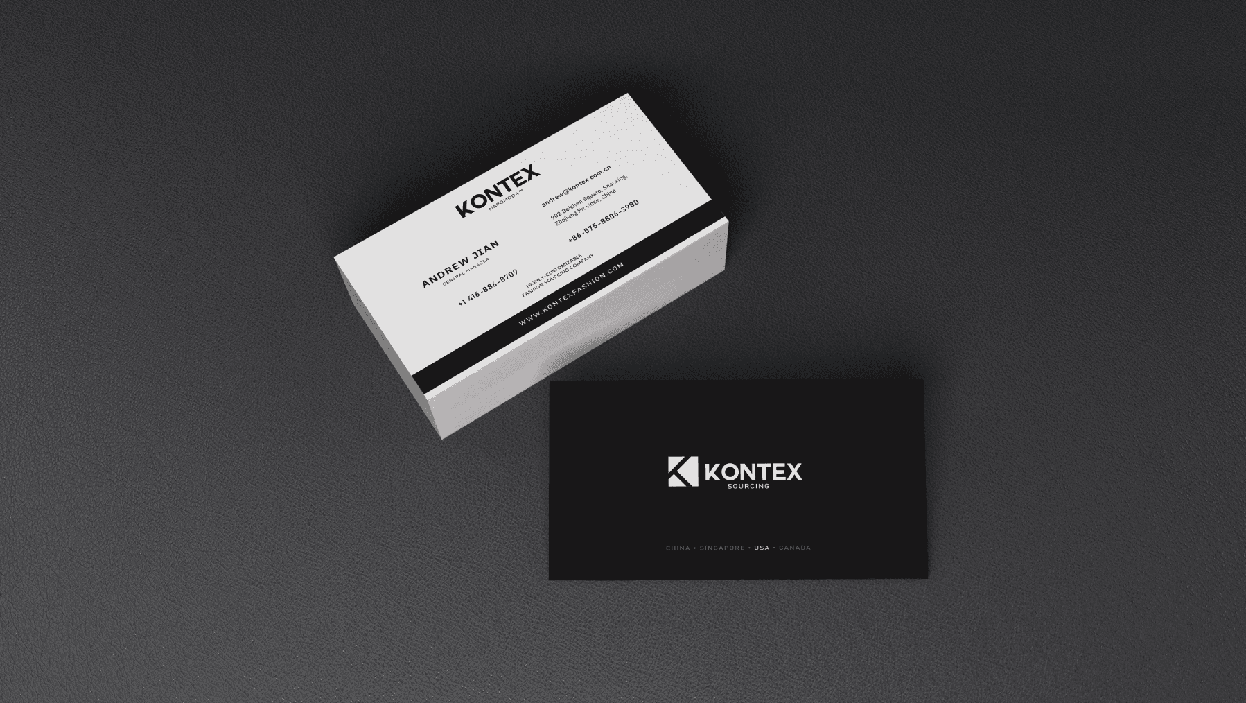
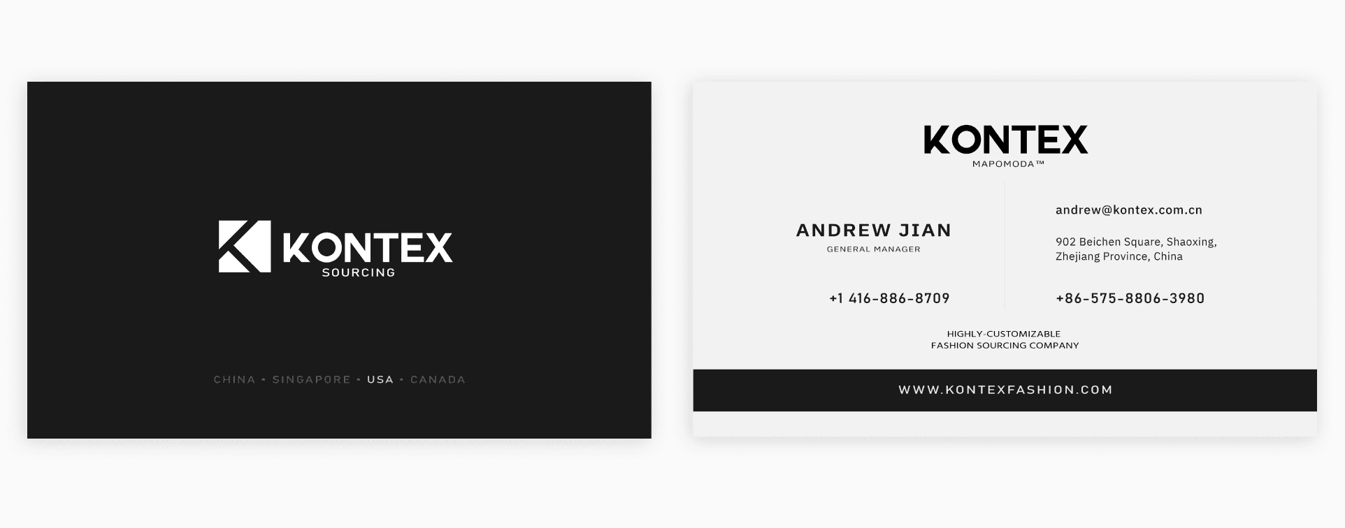
The Business Card Revolution //
In the meantime, I was also tasked with designing business cards for the Las Vegas event which posed a unique challenge. While uncharted territory, it was an opportunity to blend creativity and design into our UX-focused approach.
Challenge
How might we effectively balance limited space and the need for a clutter-free design on a business card, ensuring it aligns seamlessly with the rebranded identity while leaving a lasting impression on potential clients?

Challenge
After creating over 10 designs, I still wasn't satisfied or motivated by any of them. While they appear neat and consistent, they lack originality and fail to convey a sense of creativity.
The Eureka Moment //
Uncertain about the next steps, I sought feedback from the Kontex team. Little did I know, this conversation would change our course.
Key Finding
Designing a business card for a fashion brand meant embracing creativity and design elements more boldly than other industries allowed.
With newfound clarity, I set to work crafting a business card that prioritizes essential details and embraces creativity in a way that resonated with Kontex's luxury identity.
Design Rationale //
Creative Minimalism
I opted for a clean and minimalist layout, strategically using negative space to enhance readability and aesthetics. This allowed essential information to shine without overwhelming the card.
Visual Consistency
I ensured that the business card design was consistent with the rebranded identity of Kontex. The chosen color palette, typography, and branding elements were seamlessly integrated, reinforcing the brand's image.
Unique Design
Recognizing the importance of differentiation, I explored various design options that deviated from conventional business card norms. The final design stood out at the MAGIC fashion event, sparking positive feedback from potential clients.
Information Hierarchy
I maintained a strong focus on visual hierarchy, emphasizing critical details like the company name and contact information. This made it effortless for recipients to absorb key information quickly.
A crossroads in my creative journey led to a revelation—designing a business card for Kontex allowed me to embrace creativity more boldly. This newfound clarity paved the way for a memorable business card design during MAGIC.
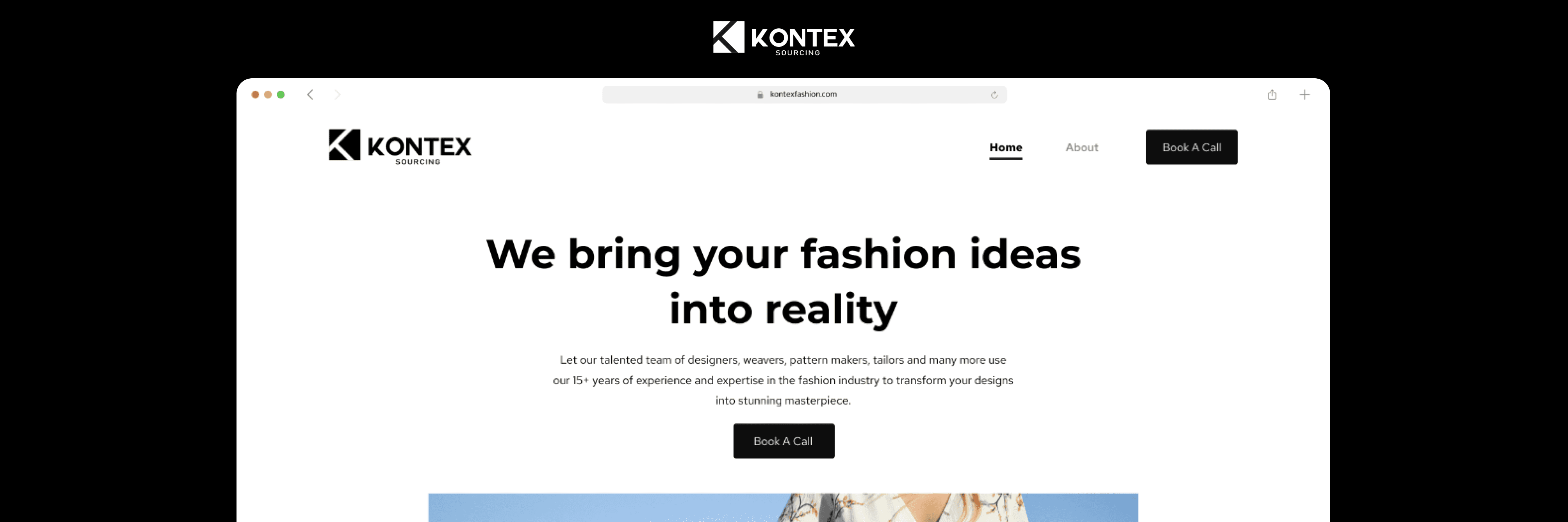
Crafting the New Identity //
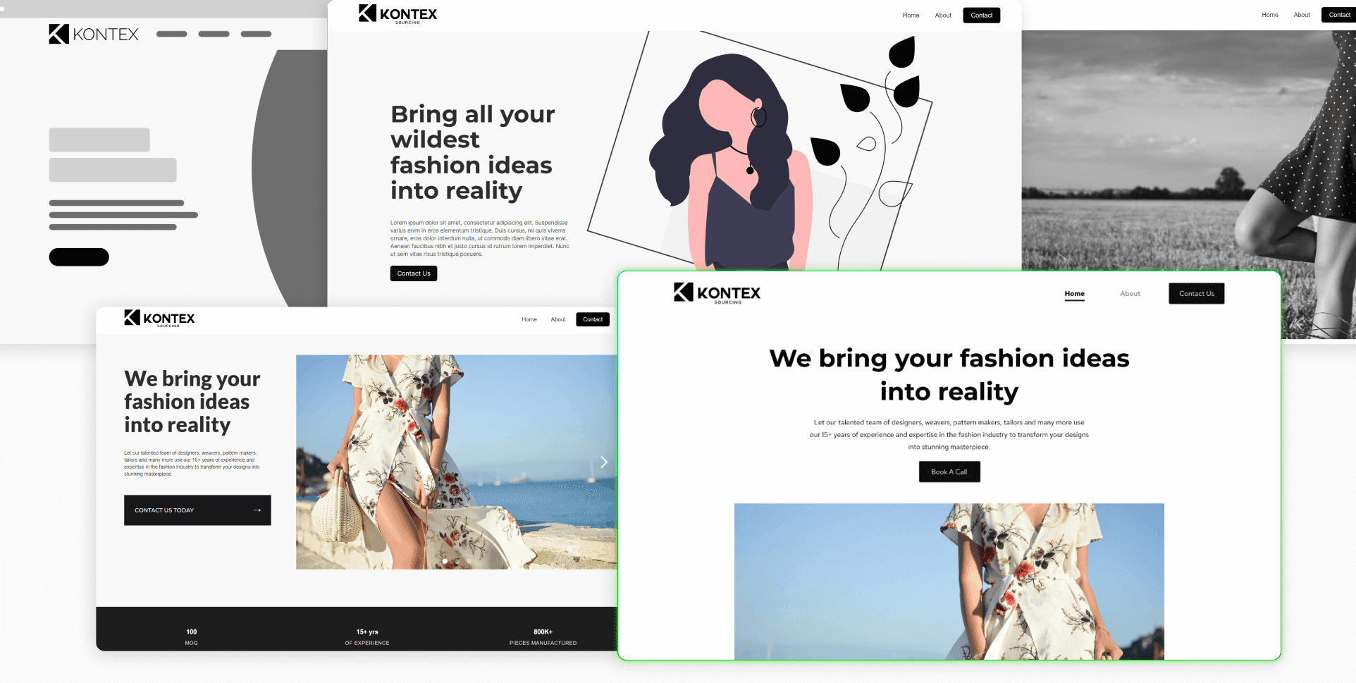
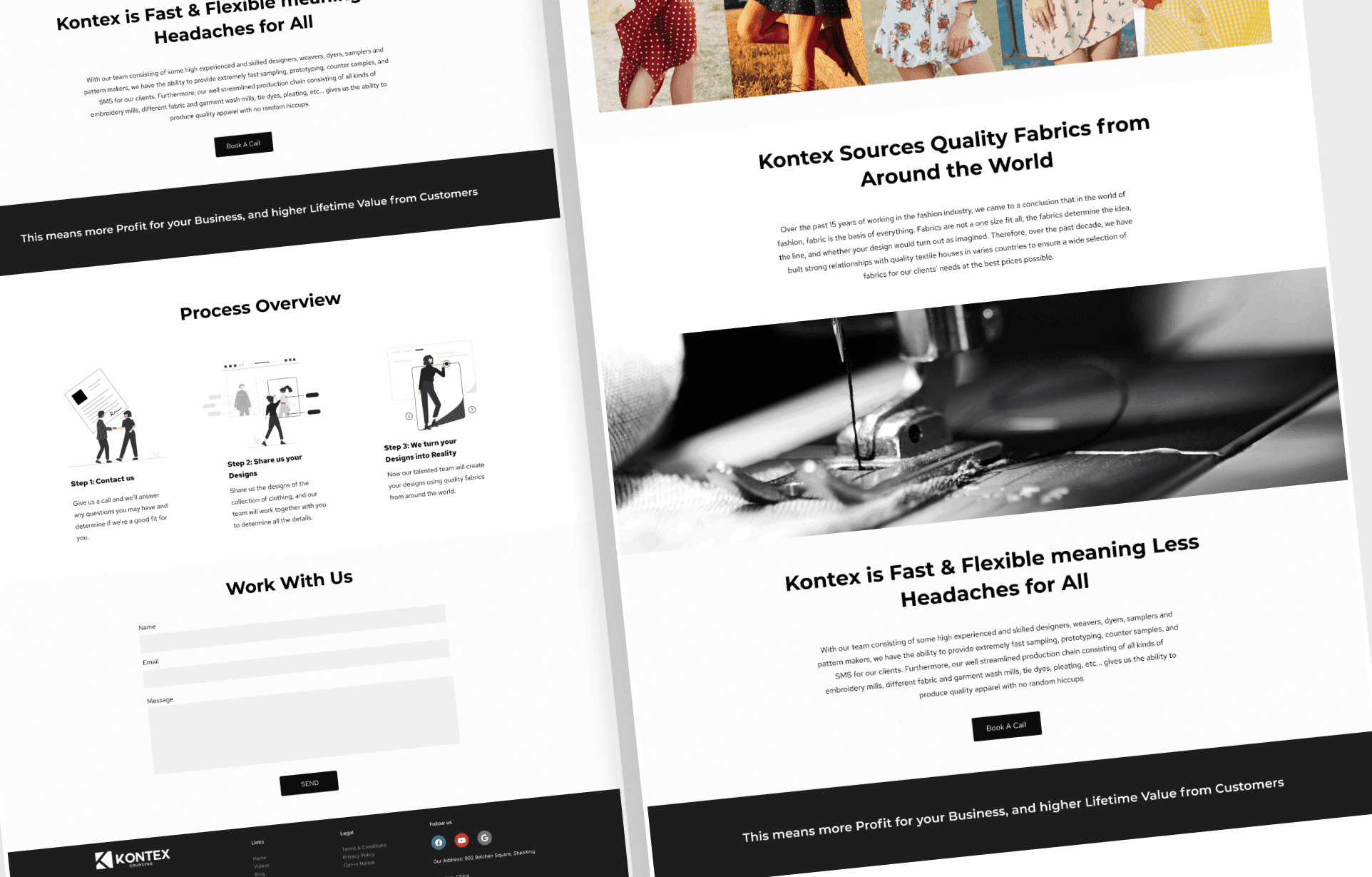
Our voyage reached its zenith with the creation of a website that would serve as the flagship of Kontex's new identity. Guided by customer journey mapping, we forged ahead with a vision of an intuitive user experience.

Landing Page Iterations //
During the redesign process of Kontex's landing page, I adhered to several key UX frameworks to ensure that the final design would effectively meet the business and user goals. I recognized the significance of presenting a strong and clear initial brand message, maintaining a clean and cohesive visual design, empathizing with the target customers, providing simple and easy navigation, and continually experimenting with different solutions to optimize the user experience.
Reason of Choice //
Strong and Clear Brand Message (AIDA Framework)
I opted for a clean and minimalist layout, strategically using negative space to enhance readability and aesthetics. This allowed essential information to shine without overwhelming the card.
Simple and Easy Navigation (Hick's Law)
I ensured that the business card design was consistent with the rebranded identity of Kontex. The chosen color palette, typography, and branding elements were seamlessly integrated, reinforcing the brand's image.
Customer Empathy (Design Thinking)
Recognizing the importance of differentiation, I explored various design options that deviated from conventional business card norms. The final design stood out at the MAGIC fashion event, sparking positive feedback from potential clients.
Clean and Cohesive Visual Design (Gestalt Principles)
I maintained a strong focus on visual hierarchy, emphasizing critical details like the company name and contact information. This made it effortless for recipients to absorb key information quickly.
A crossroads in my creative journey led to a revelation—designing a business card for Kontex allowed me to embrace creativity more boldly. This newfound clarity paved the way for a memorable business card design during MAGIC.
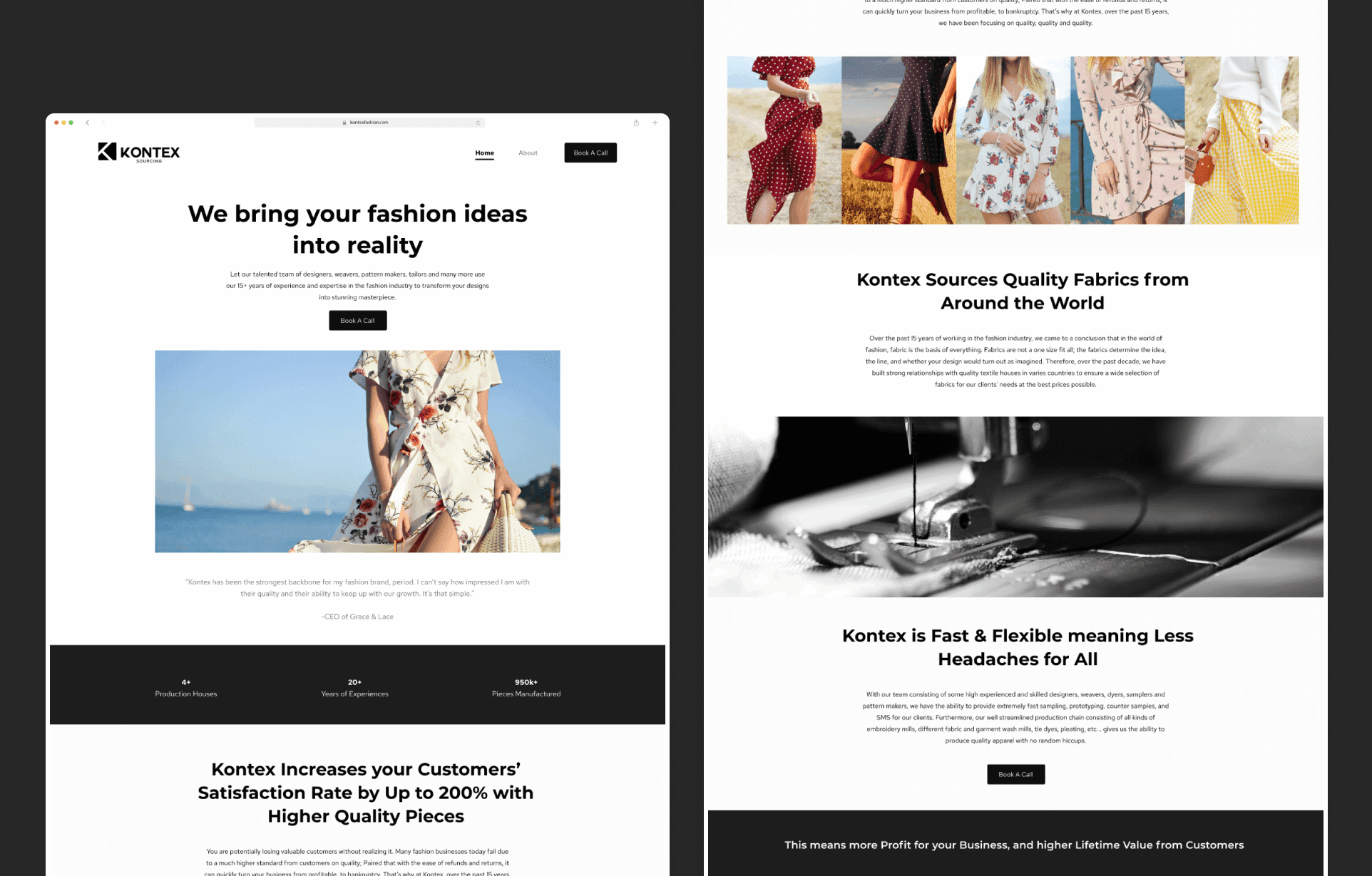
Don’t Sell Features, Sell Benefits //
By providing the features Kontex offer through customer empathy and putting ourselves into their shoes, we turn those features that customers may not care about or understand into relatability and how these features can solve their pain points.
Through user testing, I’ve gone with a top-down approach instead of a left-right approach for the information because it gives the customers a more clear path to follow and reduces potential friction.
Clear and Simple CTA //
One of the most important things in UX is reducing friction. By making the steps customers need to take as concise and simple as possible, customers are more likely to understand and better connect with your business and reach out; in turn, this drastically increases the conversion rate.
The grand reveal of the rebranded Kontex yielded resounding success. Our discussions with potential clients blossomed into partnerships with two of them. The MAGIC of Las Vegas worked its charm, and Kontex earned accolades for its brand and clothing quality.
Final Results //
Revenue:
$300,000+
Customers:
4000+
Return on Ad Spend:
3.2
Lessons and New Horizons //
As my journey concluded, I reflected on the lessons learned. The flexibility in UX design, understanding the uniqueness of each industry, and the fusion of UX, copy, and visuals for an effective landing page were among the treasures in my UX and product design arsenal.
My voyage ended, but Kontex's transformation had just begun. With a renewed identity, it is now poised to sail toward new horizons. This journey was a testament to the power of thoughtful design in driving user experiences and product success no matter what sector of business it's in.